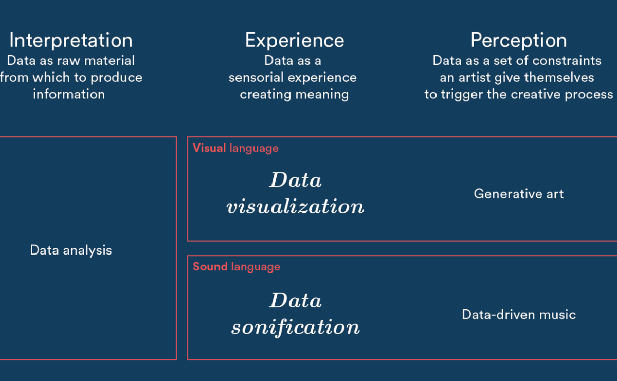
I create , I also and about data visualization.
June 1, 2021
Electricity Prices Website
At Interactive Things, I implemented the official platform to document and compare electricity prices across cantons, municipalities, and network operators.
View online →
May 31, 2021
#30DayChartChallenge
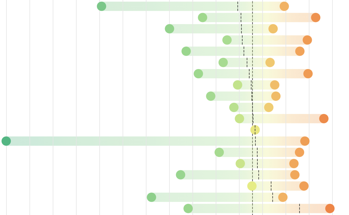
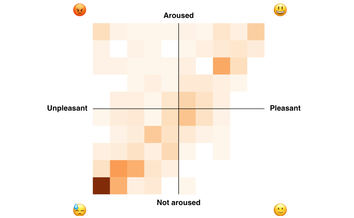
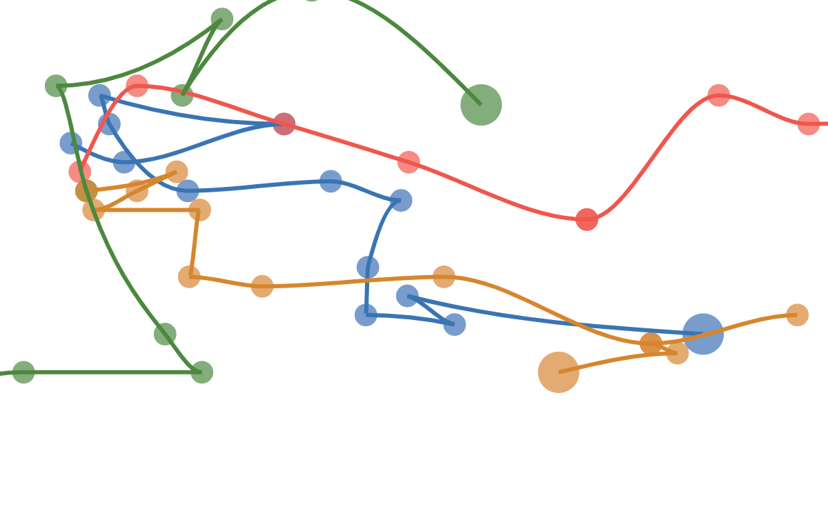
In May 2021, I participated to the #30DayChartChallenge. In the end, I only managed to publish 11 charts, but I woke up every day of May full of new ideas and a drive to create new data visualizations, which was great! I also used this opportunity to focus on Observable.
View on Observable →
October 14, 2020
Don't underestimate the power of community!
I participated to a panel discussion organized by the Data Visualization Society about early careers in data visualization.
View on Youtube →
August 13, 2020
The Grammar of Vega-Lite
An Observable notebook that I created for a hands-on online workshop about using Vega-Lite to explore a dataset and sketch visualizations.
Fork on Observable →
August 12, 2020
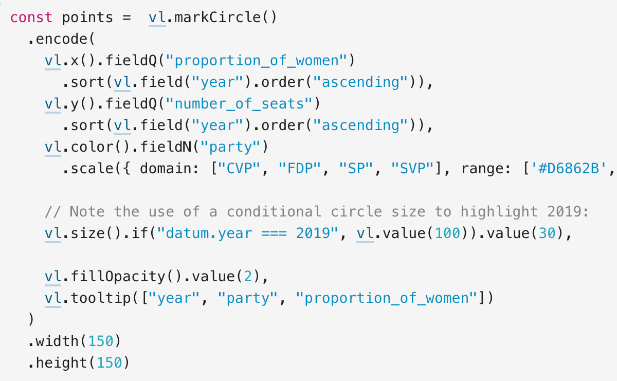
Data Exploration with Vega-Lite & Observable
Beginner-friendly tutorial where I explore a dataset about the gender gap in the Swiss parliament, using Vega-Lite & Observable.
View on Youtube →
June 9, 2020
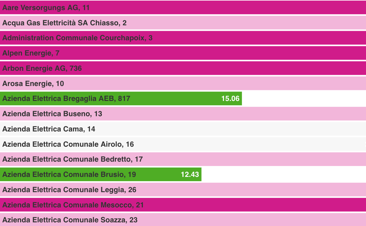
Electricity Prices in Switzerland
A notebook exploring electricity prices in Switzerland, preliminary work to a project for the Swiss government.
Read on Observable →
May 30, 2020
Visualize Swiss Open Data
The official visualization tool of the Swiss confederation, that I created at Interactive Things.
View online →
May 23, 2020
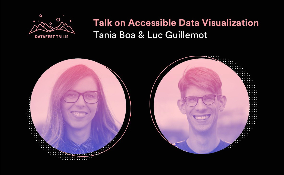
Accessible Data Visualization at DataFest 2020
I was invited to DataFest Tbilisi 2020, along with Tania Boa, to share our approach to make data visualization more accessible to diverse audiences.
View on Youtube →
February 6, 2020
Ggplot & the Grammar of Graphics
I gave an introduction to the Grammar of Graphics, before a hands-on tutorial to ggplot, with Thomas Favre-Bulle.
View on Meetup →

August 6, 2019
Accessibility & Data Visualization
Tania Boa and I shared our design & technical approaches to making data visualizations more accessible, in a community meetup in Zürich.
View on Meetup →
July 31, 2019
Brand Communication for IXT 10 year Anniversary
I created a notebook to generate brand design elements for the communication around the 10 year anniversary of Interactive Things.
View on Observable →
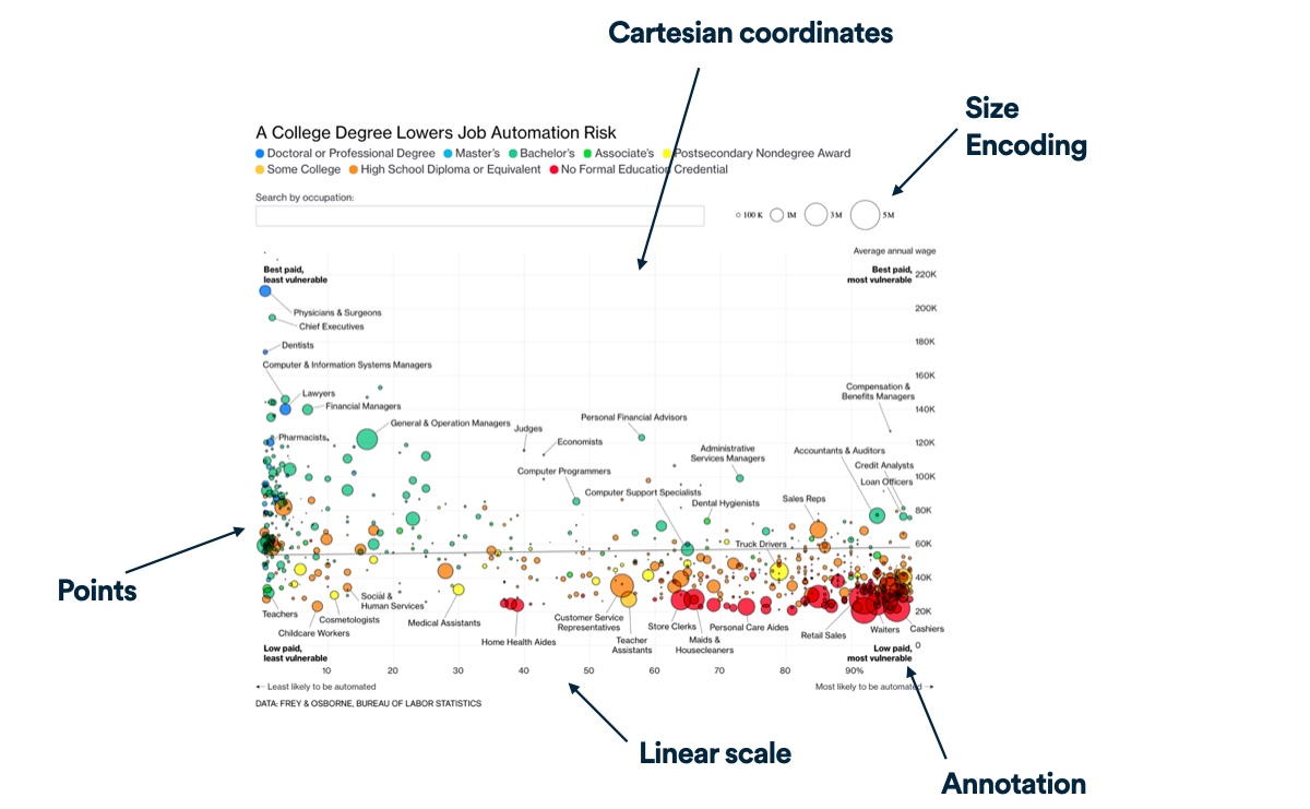
March 21, 2019
How We Visualized the 43 Indicators of OECD's Going Digital Toolkit
I wrote an article about the process that lead to designing and implementing a scalable chart system used to visualize every indicators in the platform. Every little decision counts!
Read on Medium →
March 1, 2019
OECD Going Digital Toolkit
At Interactive Things, I helped creating a data platform about digital transformation for the OECD. I mostly worked on implementing visualizations for the 43 indicators in the report.
View online →
October 15, 2018
How Does this Data Sound?
I researched ways to make data visualizations more accessible using ARIA syntax and sound to account for variations in a dataset.
Read on Medium →
September 30, 2018
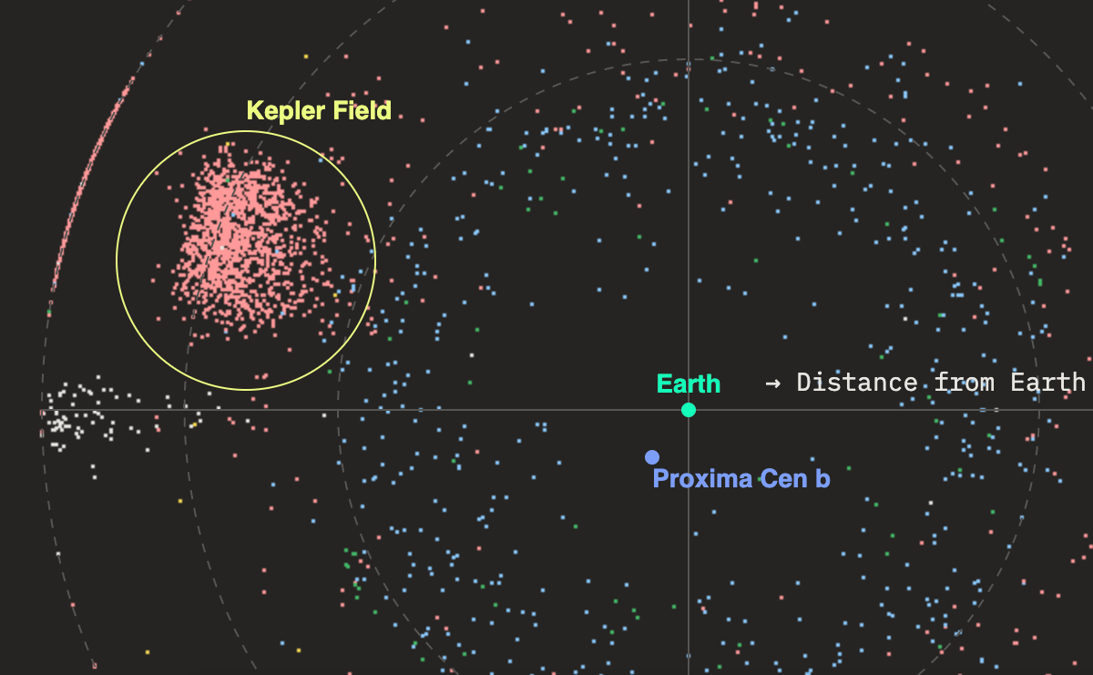
Looking for the Earth Next Door
I created a "scrollytelling" data story about exoplanets, with Nadine Prigann. It defines what makes an exoplanet possibly habitable. The story starts with all known exoplanets, and narrows down to the best candidates for human habitation.
View online →
May 31, 2018
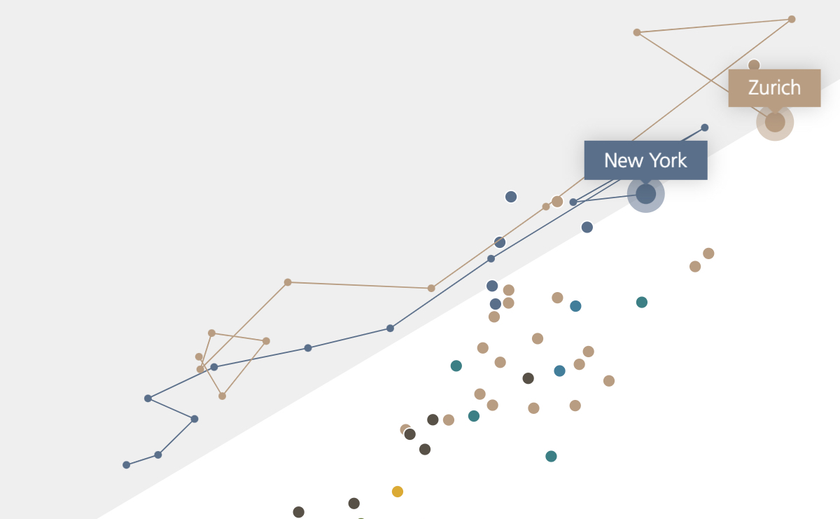
Prices & Earnings
Interactive report on the cost of living in cities around the world for UBS.
View online →
January 28, 2018
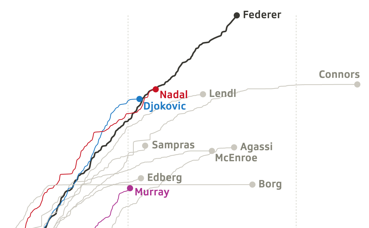
Data Story on Roger Federer, Collaboration with SRFdata
I collaborated with Benja Zehr and Tania Boa to develop this data story about the career of tennis player Roger Federer, for the Swiss media company SRF.
View online →
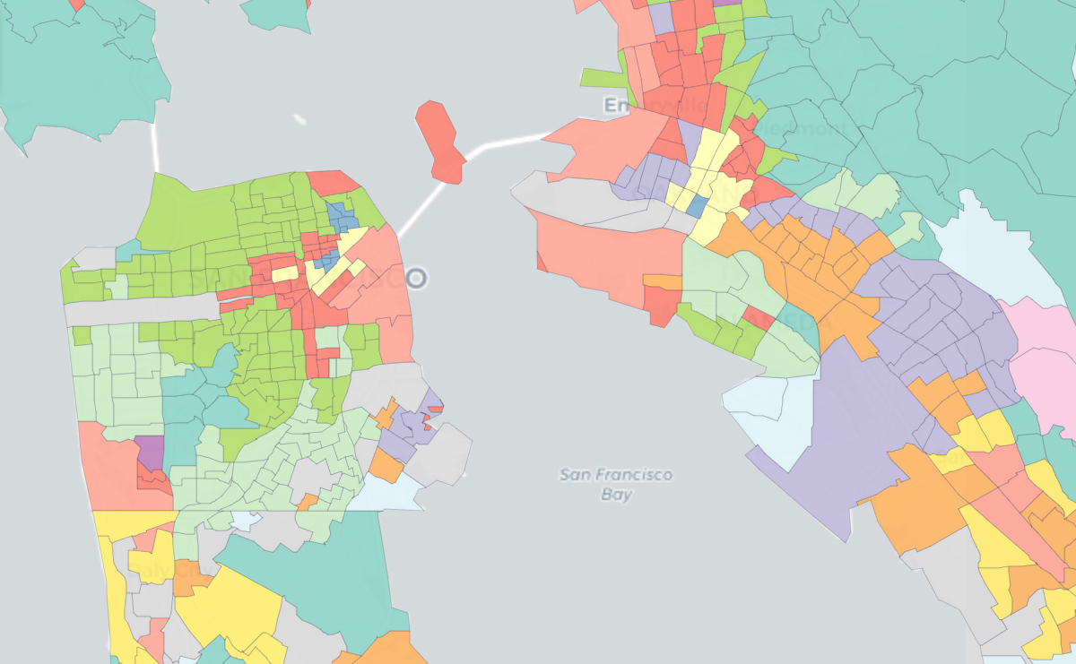
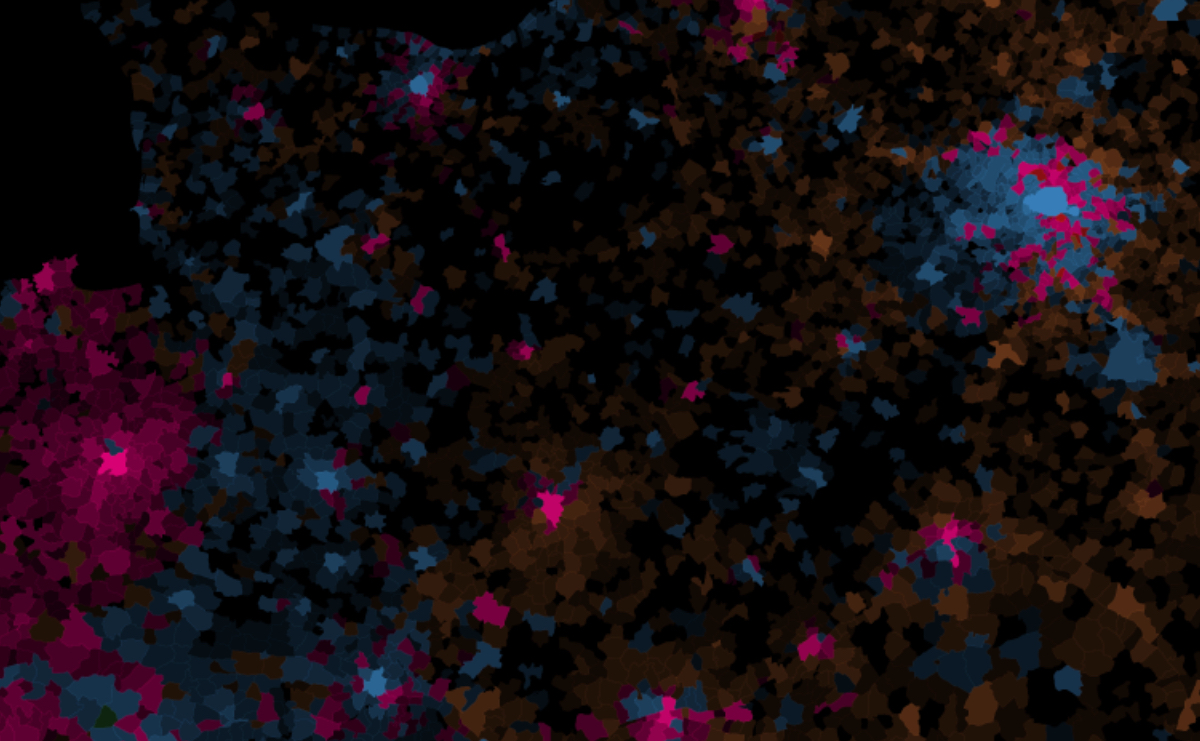
September 21, 2016
Bay Area Geodemographics
I created a classification of neighborhoods using hierarchical clustering on Census data, to track neighborhood change in the Bay Area. This project is part of my postdoctoral research at UC Berkeley.
Learn more →
December 29, 2015
Glowing Maps, About Electoral Maps and Demography
I published in the newspaper Libération maps of the regional election in France, using value-by-alpha maps to emphacize the urban strongholds against far-right parties, with Manouk Borzakian.
Learn more →
September 22, 2014
World Urban Factory
A peak into the history of the World greatest cities, since the very first one. This animated map is featured in the scientific film Urbanités.
Learn more →
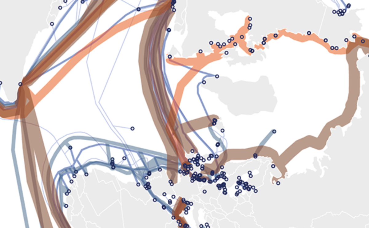
September 15, 2014
The Making of a World-Society, Internet & Net Neutrality
These maps are part of my PhD dissertation, where I analyzed the emergence of a World-society through the intertwined futures of Internet and the World as a political entity.
Learn more →