Glowing Maps for 2015 Elections in France
Following last December elections in France, a plethora of maps has been published in newspapers and blogs. Most of them use a municipal (the authority responsible for collecting votes) or regional base map (the election aimed at electing France’s 15 regions presidents). By doing so, they gave a graphical importance to the many rural areas of France. The over-representation of square kilometers over population is a long-debated flaw of electoral cartography that can mislead political analysis. Together with Manouk Borzakian, I published in the newspaper Libération maps that attempt to overcome this issue. It is not about depriving electoral maps from their heuristic power, but rather to bring light on the long process of creating a map. A long process where numerous representation choices have to be made, whose impact on the output map is important enough to lead to diverging analysis. Here is an account of the article.
Lying (More or Less) With Maps
Lolcats or campaign promotion ads are a few of all the images that surround us, although the misuse of images is an old refrain in western cultures. An election is always a good occasion to analyze the use of images produced by newspapers and how the mystique of the map operates. Readers are supposed to trust what a few streaks of colors on a reduced France tell without thinking of how the maps have been made and the infinite ways the same dataset can be mapped (base map, colors, statistical levels, etc.).
To accompany the obsession for the National Front (far-right nationalist party, eurosceptic and anti-immigration) that newspapers have been into during last regional election, results maps have been used to support catchy titles using the lexical fields of natural disasters or epidemics: wave or tsunami “bleu marine”, France gnawed by a “cancer”, etc. But what do these maps really tell? How are they constructed?
The Base Map: Dead-Center of Electoral Maps.
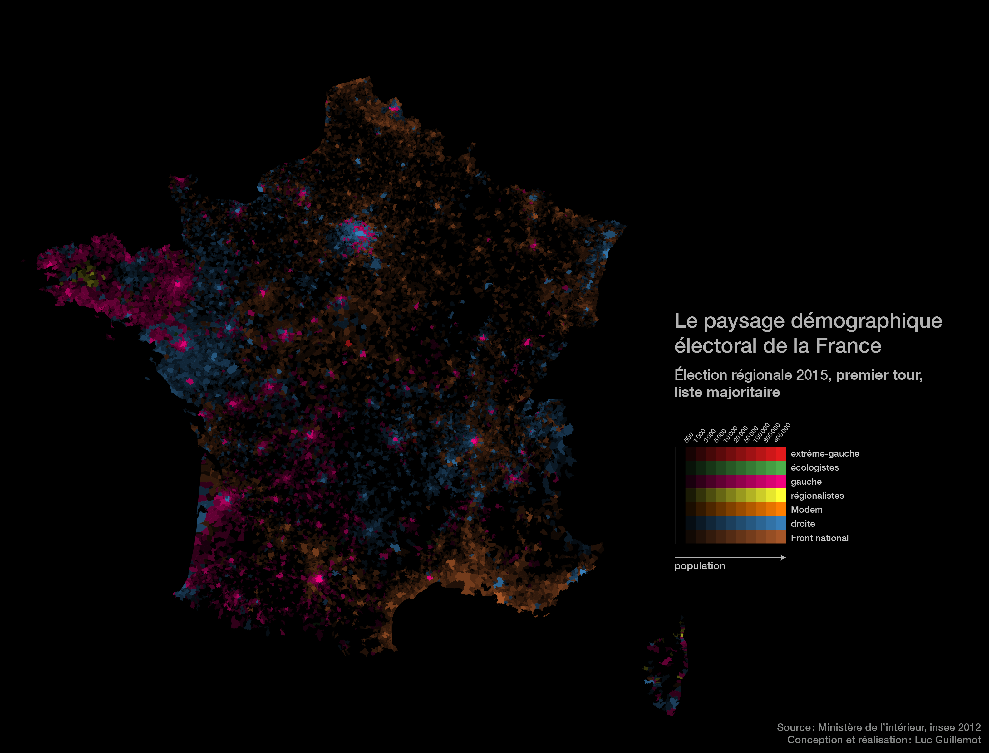
A map is a contract between a map maker and a map reader involving putting on a representational space (the map) the repartition of social phenomena (oil fields, football players, war, etc.). To give directions, hiking maps use for instance a topographic base map with trails and contour lines. Electoral maps depict the space of an election (region, department, municipality, etc.) but the focus of the analysis is supposed to remain on the people who vote to reckon the highly social phenomenon that an election is. With the praiseworthy didactic aim of getting scores in a municipality by clicking on it, the maps published in many newspapers tend to eclipse one of the main features of the electoral space: the voters. On a classical choropleth map, each municipality is assigned a color or a value according to the leading party or the percentage a party obtained. Among others, the prospective map by Liegey Muller Pons is a striking image of a uniform France: no matter the population of a municipality, the space it occupies on the map is set by its area.
As it happens, the “classical” maps of this regional ballot use both regional and municipal base maps with the Euclidean space as metrics (the space of our middle school geometry classes: two dimensions with distances in meters). As a result, the territory is represented uniformly and almost empty municipalities (about 27’000 among the 36’000 municipalities in France count less than 1’000 inhabitants) get the same visual impact as big cities, whereas forests, fields, meadows and highways are space-consuming but don’t vote. Meyrueis, for instance, lovely hamlet in Lozère, with 814 inhabitants and an electoral body of 651 possesses the same graphical weight as Paris, both of them having an area of about 100 km2.
Two graphical remedies.
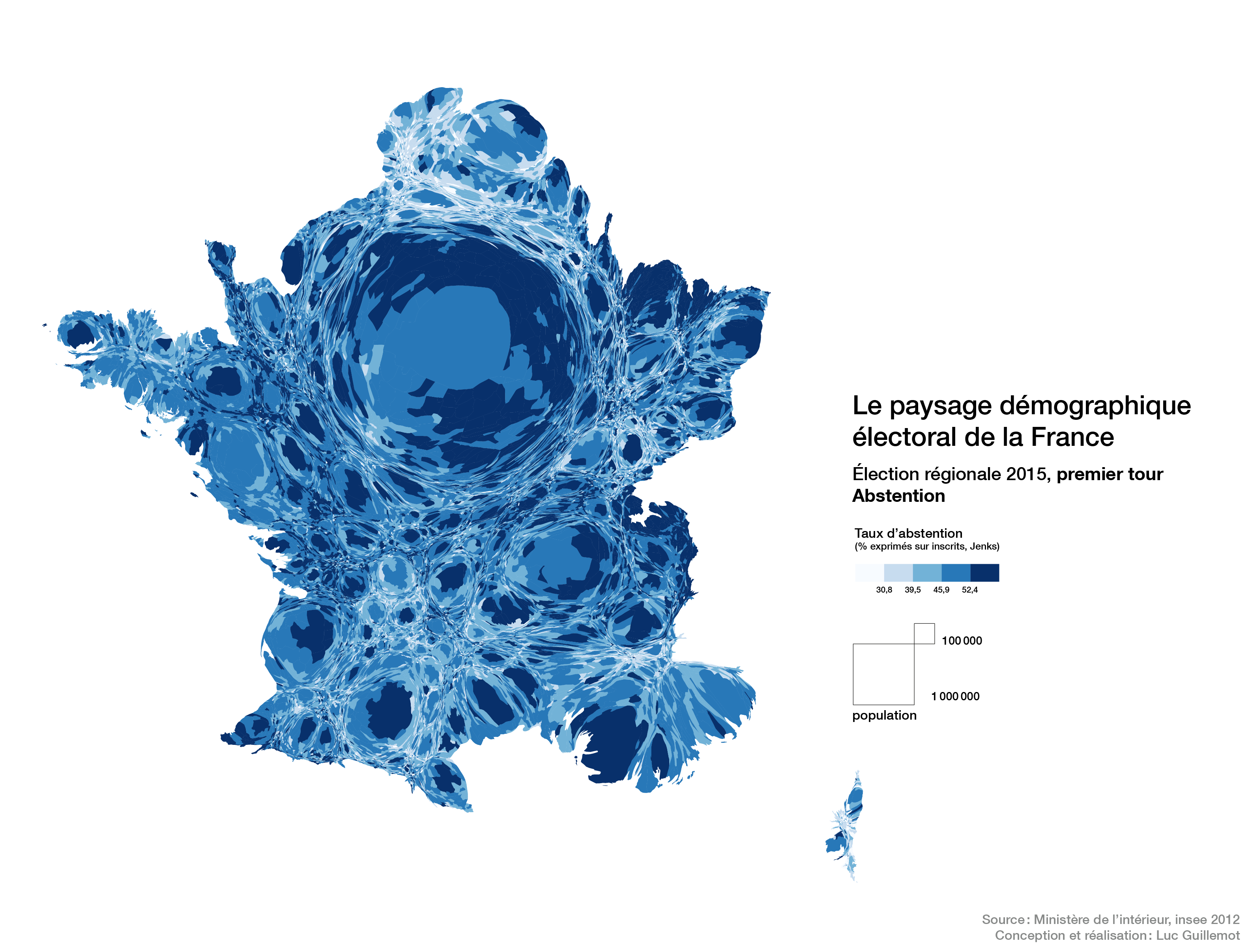
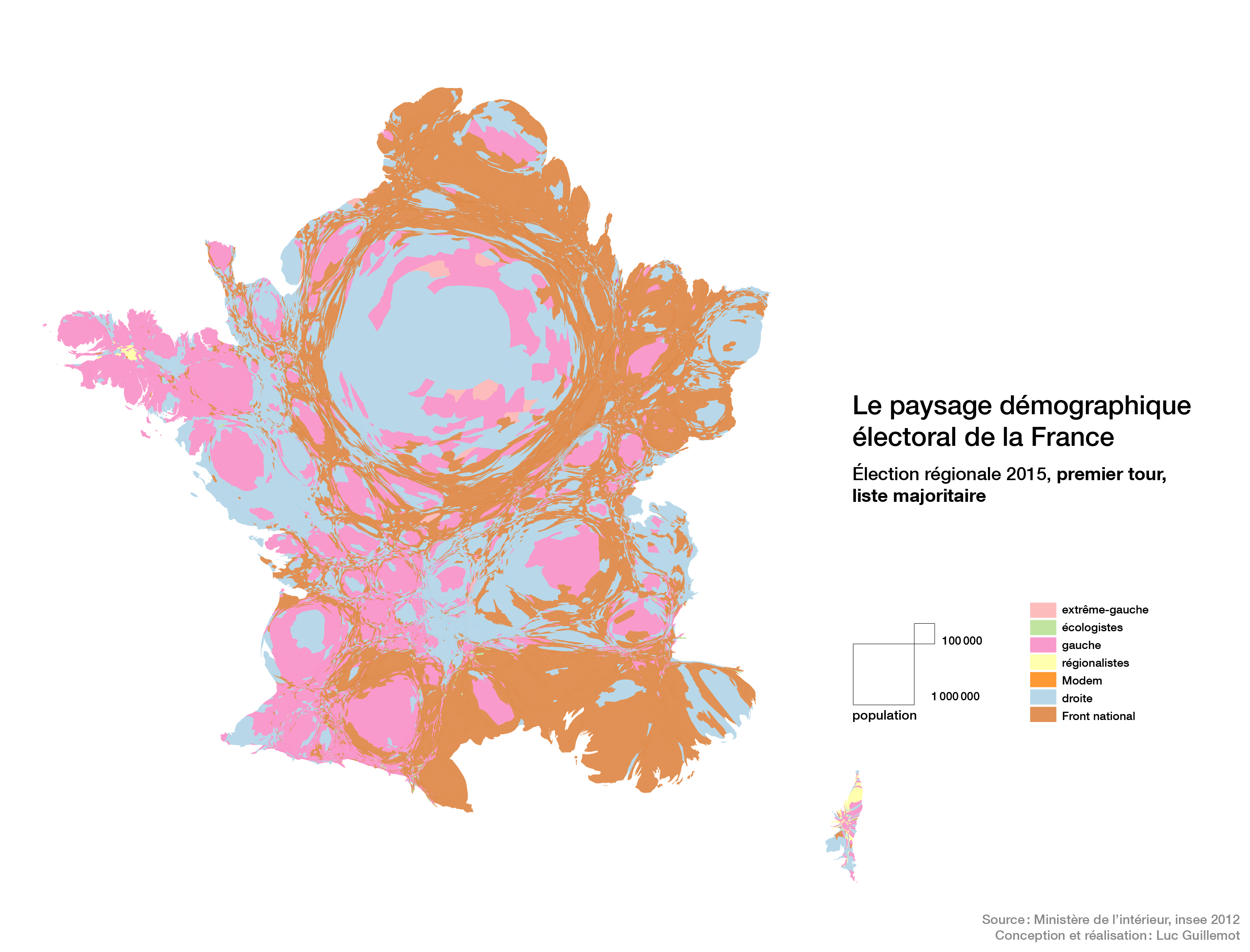
Cartograms make the surfaces on the map match the demographic weight of each entity: for electoral maps, the visual predominance of a color accurately corresponds to the party prevailing in the country. The above map unravels abstention as a mostly urban phenomenon, with a percentage above the national average in city centers and in near-suburbs of major urban areas (Paris, Lyon). Likewise, the cartogram below with the list in the lead after the first round depicts a more subtle image of the room occupied by the National Front, less distorted than the image of a “cancer” crawling into France, with 27.7% of the voting body and therefore the same share of space on the map.
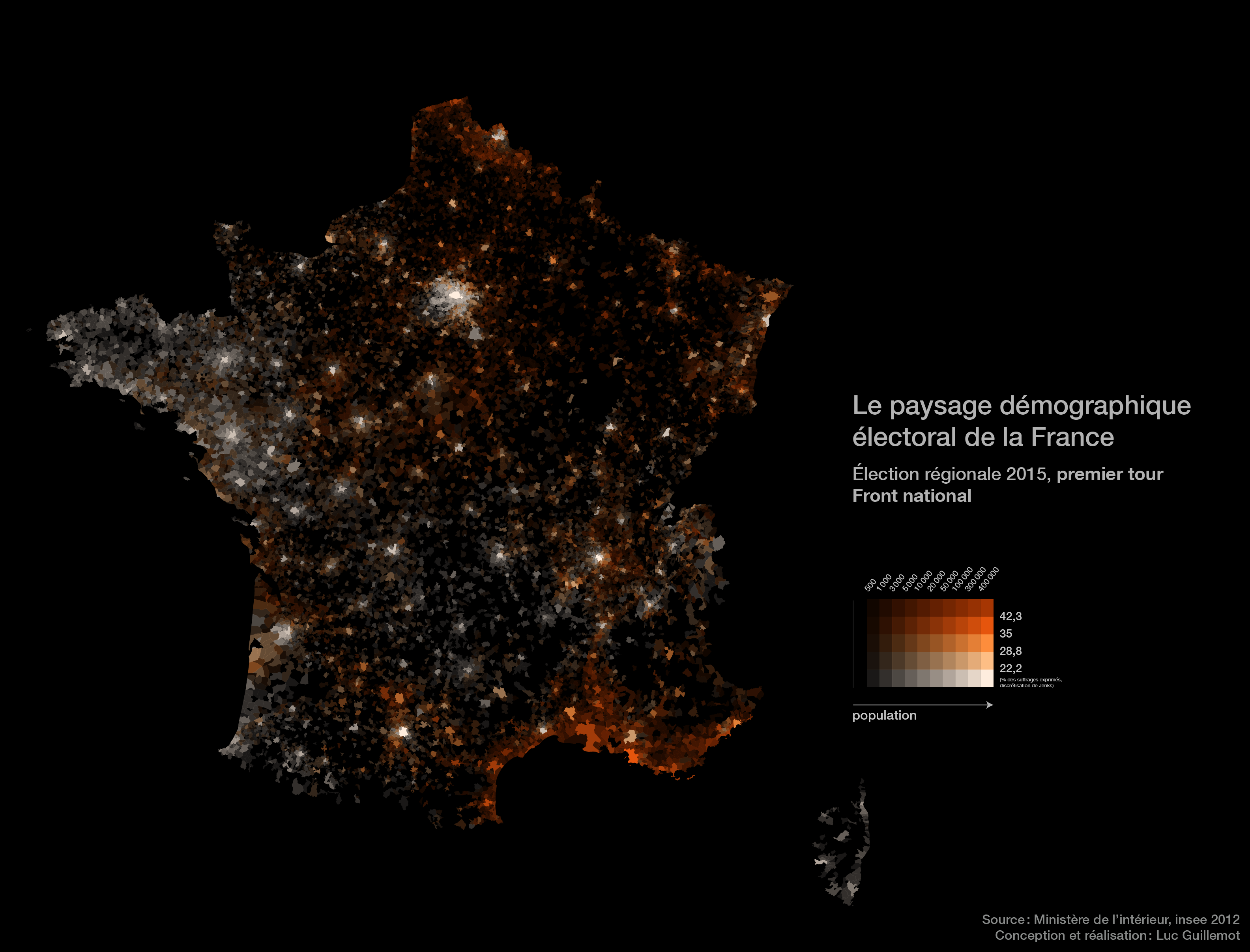
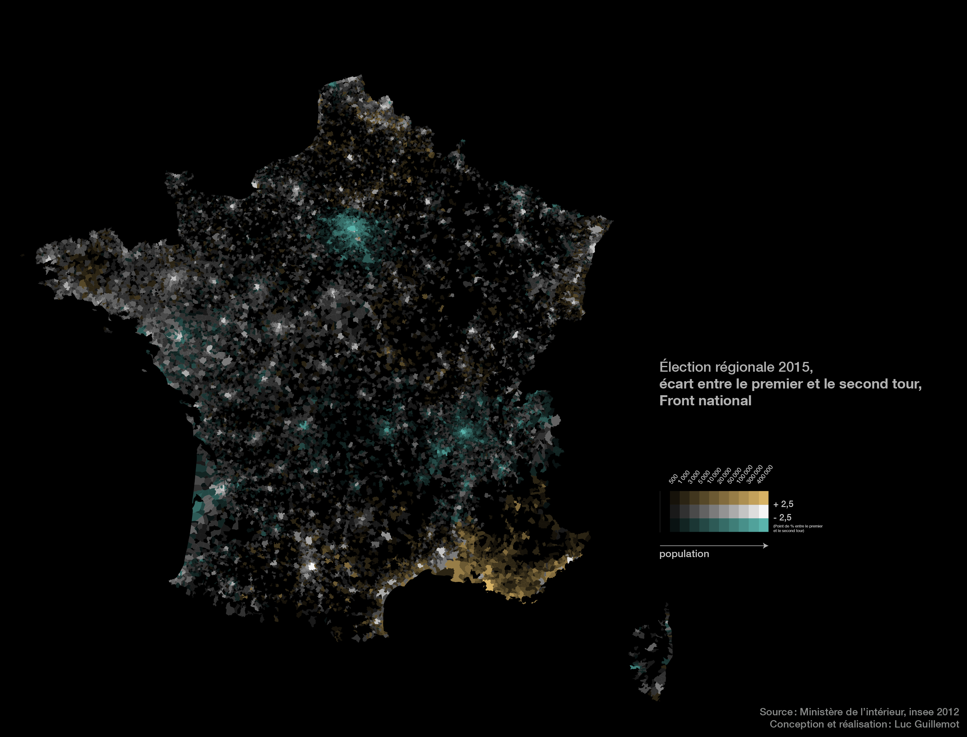
Another tool aiming at representing spatial entities according to their demography is the use of opacity: value-by-alpha maps, made popular by Andy Woodruff, are maps whose luminosity varies with the population. Their advantage is that they preserve the Euclidean base map we have been used to in school textbooks. On the map on top of this page, the most populous municipalities stand out whereas the less populated ones almost disappear in the black background.
Urban Voters, Country Voters.
Another representation means another interpretation. Those maps don’t nullify a regional reading: the Mediterranean rim is well known for leaning significantly towards the National Front. Marine Le Pen’s party scored indeed among its best results in Fréjus (50.4%), Marignane (57.6%) or in the former communist stronghold of Martigues. Notwithstanding, another geography of the Front National prevalence arises from these maps: the opposition between urban areas, suburbs and the countryside (“levels of urbanity” as phrased by Jacques Lévy). As a matter of facts, the most far-right-leaning regions are not homogeneous: although the National Front is leading in most of Northern France Municipalities, the pink (or vivid white) of Lille and Villeneuve-d’Ascq contrasts strikingly with the amber streak in the former rust belt. Likewise, Nice, Aix-en-Provence or Montpellier constitute the last stopping points to the National Front progress on the Mediterranean Coast. The map of the evolution of results between the two rounds strengthens this analysis: the urban areas of Paris and Lyon have turned down even more the National Front and, in the most approving regions, city centers have resisted more than their suburbs to the appeal of the National Front (Narbonne, Béthune, Lens, Douai, Amiens—excluding Marseille).
Maps are not self-sufficient as a basis for political analysis, but are rather useful to make apparent the specific geography of electoral behaviors. As a matter of facts, these maps allow to put the hypothesis that two “anti-establishment” stances correspond to two opposite geographies: the Front national in the least urbanized areas and abstention in city centers.